

Free shipping is a staple of eCommerce. It’s highly expected, it’s highly sought out, and if it’s not available, it may be the reason a visitor doesn’t purchase.
Thanks to modern platforms, offering free shipping is not difficult (aside from the hit your profits may take). But if you’re really looking to get the most out of that offer, there are some strategies you will want to consider implementing.
This series will cover three of those strategies – the three we look for and recommend most to our retail clients:
- Better placement – moving your free shipping notice beyond the site-wide banner
- Utilizing your cart page
- Eliminating all confusion
In this article, we will address the first strategy and show concrete examples of what to change for your store.
Fighting Against “Banner Blindness”
For most retailers, the free shipping offer is stated in one of these locations:
- The site-wide banner at the top of the page
- Below or near the page header
- In a modal pop-up that loads for each new visitor
These placements have become the default over time, because they’re what are most often seen for eCommerce sites. As a result, designers and content managers assume these as best practice to feature free shipping offers.


The mistake here is not that these are the “wrong” locations – it’s that they shouldn’t be the only ones you use.
As consumers become more experienced with shopping online, they’ve developed “banner blindness” – meaning they’ve learned to quickly ignore any content that feels like an advertisement.
Pop-up modals are the worst offenders. They are seen as such a disruption to the shopping experience, most visitors will immediately close the pop-up without noticing its content or abandon the site altogether.
This is often true with the banner and header placements as well. Users tend to ignore these areas under the assumption that they contain generic information, not relevant to what they’re looking for.
Additionally, the headers are easily missed because they are mixed in with other content such as navigation, search, filters, etc.
“Of course, it depends to some extent on the design of the information in the header and the particularities of a specific site, but the core finding from testing was that a significant amount of users (as many as 27%) won’t see information placed only in banners or headers.“
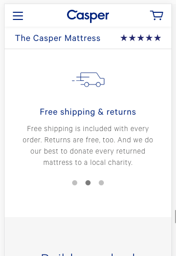
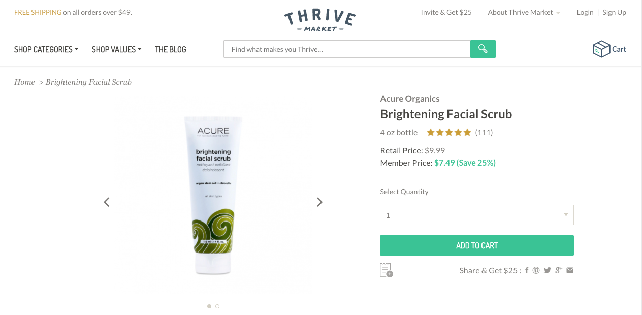
Place Free Shipping Offers Near the Add to Cart Button
An effective way to make sure that most visitors are seeing the free shipping offer is to include it near the “Add to Cart” button on your product pages.
This is because that this location is at the product level where users have drilled down to a very specific item that they are interested in. Here they are more likely to engage with the content related to that product because of it’s high relevancy to them.
Think about when you shop online and are looking at a single product page – you are, most likely, very focused on the information displayed in the “Buy” section (e.g. price, sizing, description, variations, etc.).

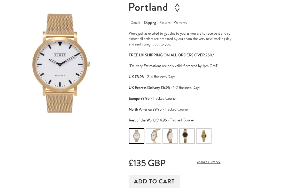
Free shipping information can (and should) still be placed in site-wide banners or page headers, but you should always duplicate it near the “Buy” section to make it more noticeable to your customers.
Another effective placement is on the cart page, which we will get into in more detail on part 2 of this series.
We are often working with retailers to implement these strategies for their online store. Please get in touch with one of our experts if you are looking to raise conversions on your site.